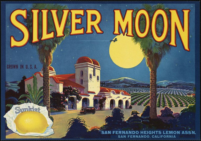
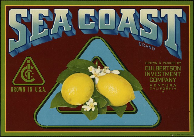
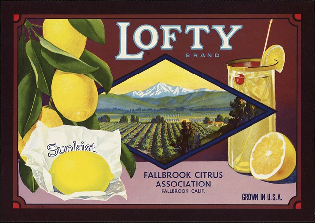
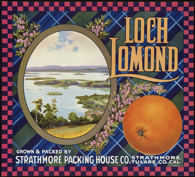
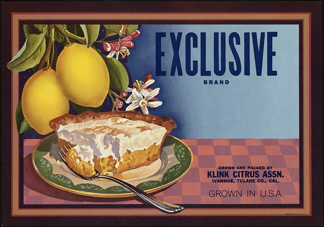
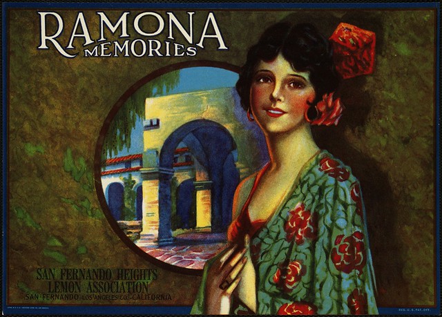
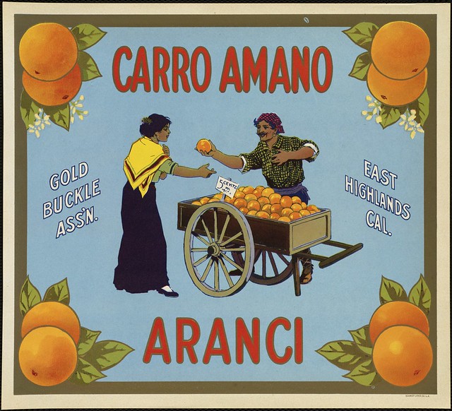
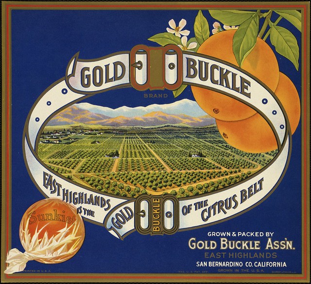
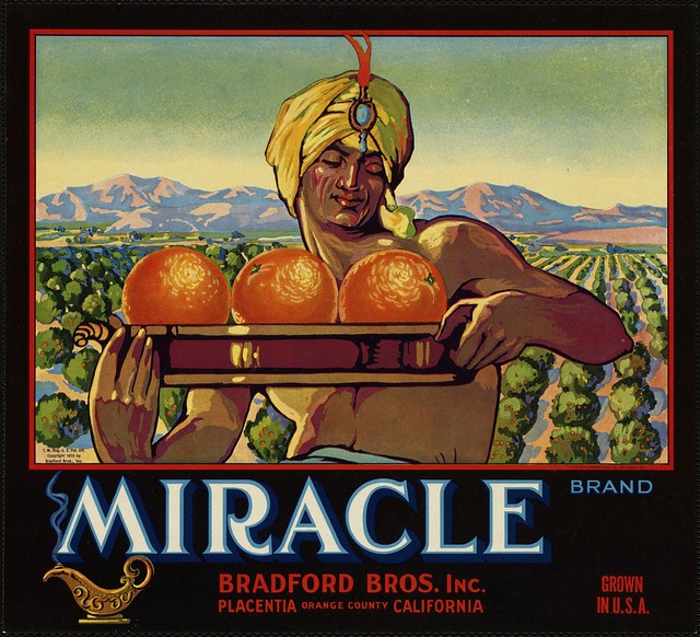
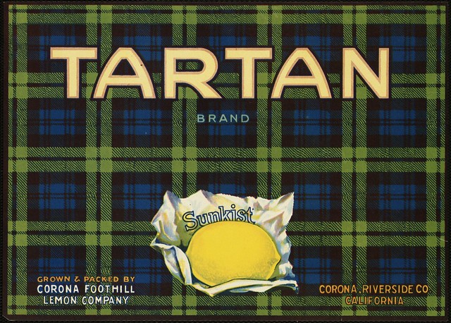
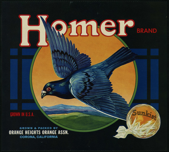
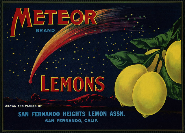
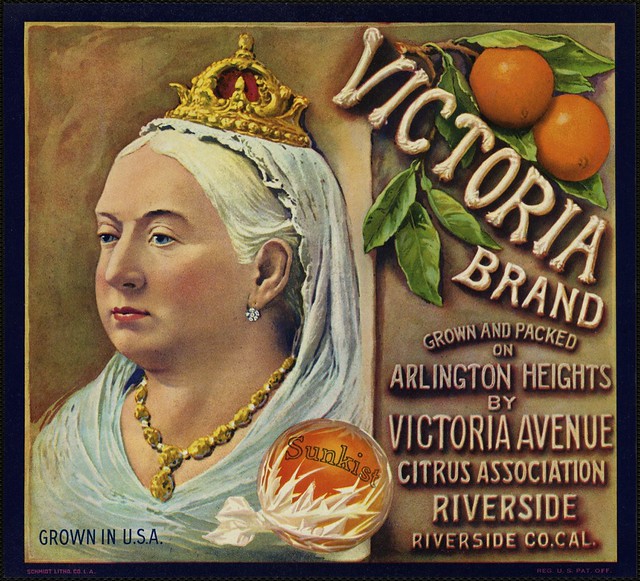
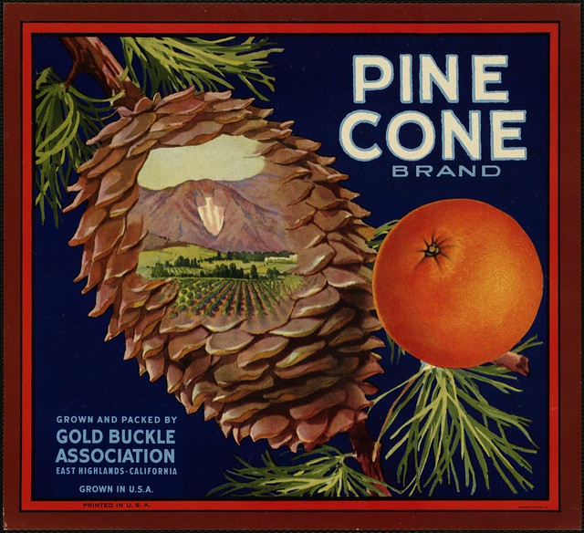
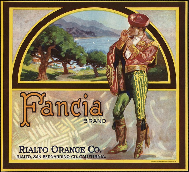
I‘ll let you in on a little secret. Backstage at Messy Nessy Chic, we’re in the early stages of a website re-design; an image overhaul, a shiny new make-over! And of course when it comes to any kind of re-decorating, you need inspiration. On the look-out for beautiful typography, colour palettes and shapes, I came across these vintage produce crate labels from a collection at the Boston Public Library. Oozing with creativity and imagination, one has to ask; why doesn’t food packaging look like this anymore?
A little backstory about the labels from the Boston Public Library:
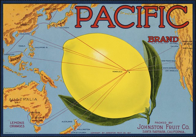
Prior to World War II, produce was packed in wooden crates with attractive labels, designed to catch the buyer’s eye, pasted on the ends. After the onset of war, rationing, cost cutting, and a search for cheaper materials in every industry motivated the fruit packers to experiment with cardboard containers.
Since wooden crates were more labor intensive, and most available manpower was involved with the war effort, cardboard containers eventually prevailed. By the early 1950’s, wooden crates had almost disappeared from the packing houses. The transition to cardboard containers left warehouses full of unused labels.
Looking forward to a MessyNessyChic re-design?
All images courtesy of the Boston Public Library Flickr page
:::
YOU MIGHT ALSO LIKE:
.